
Poster Series

Drought Poster Series - A series of posters were designed with the purpose of rebranding the perception of the drought to communicate the importance of water conservation. This was a 1 hour Visual Design project created by 50 UX Design students who were divided into teams of brand story, text and content, typography, color and layout to rebrand the drought in California. Our team needed to present typography and color palette that reflects a softer approach that establishes an emotional connection, as opposed to the alarming palette depicted today. Tools used include the whiteboard, the web, and Adobe Color CC. Below is a gallery showing some of the research involved in the project.
THE REMAINING COLOR PALETTE
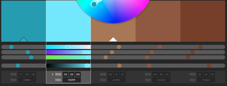
Our team researched several existing palettes that included beige and wheat palettes and alarming red tones. Our team picked up on other underlying tones, and aligned on a more subtle palette of blue shades to mimic sky and water, and brown shades for consumers to associate with the earth, soil, and almonds.
TYPOGRAPHY
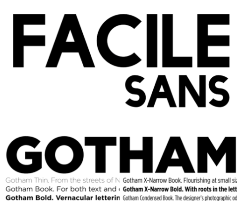
Our team modernized the drought by selecting playful sans-serif fonts. Facile Sans features thin strokes and rounded out corners that give the poster a welcoming, whimsical appearance. The alternating thin and thick strokes and stroke modulation makes the font more quirky (ie—the "S") and humanist in design.
Gotham served as the sub headline, conveying a subtle, modern and playful approach with its bold blocky letters. It's contrasting bold letters played as the perfect complement to the quirkiness of Facile Sans, giving an underlying serious tone to this playful and quirky poster.
FURTHER STEPS
Because the drought is an ongoing issue, the bathtub poster was the first in a series of informational posters empowering consumers to take action by reducing their water footprint. I added to the series of posters that illustrate other quantifying facts. The series will continue to inform users on their impact of water consumption by providing new impactful facts, and using visual storytelling to communicate the significance of working together to solve this problem.
ROLE
Worked on the typography and color palette team consisting of 10 other UX Design Students. Worked agilely with other teams (brand story, content and layout) to present the first rebrand poster of the drought series.
SOLUTION
Design a series of posters with a subtle alarming tone to educate, inform and encourage water conservation, and inspire consumers to act. The new approach achieves this by providing the following:
- An educational fact about water to give individuals perspective on their personal water footprint.
- Imagery and colors that complement the message and communicate the power of conservation.
- Relatable messaging that encourages individuals to conserve their personal water consumption.
RESEARCH
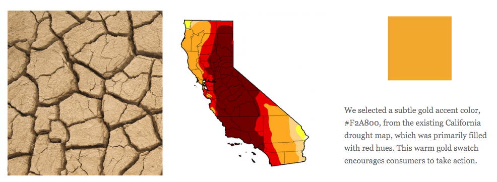
We selected a subtle gold accent color, #F2A800, from the existing California drought map, which was primarily filled with red hues. This warm gold swatch encourages consumers to take action.
IMAGERY
Existing imagery and palette uses an aggressive approach to convey the drought: wheat beige tones alert the viewer while bright red hues prompt urgency.
Collateral

You Deserve More Flyer - Four versions of this brochure were created, one for each of California Casualty's target markets: Educators, Firefighters, Law Enforcement Officers and Nurses. This customized brochure provides relevant content and features lifestyle images to help individuals envision a life with better service and savings in their insurance policy. Shown here: Educational brochure.

You Deserve More Brochure - This brochure was designed as part of the same campaign as the flyer pictured to the left. Field Marketing Managers could pass on either the brochure or flyer to potential prospects. The brochure emulates the same style of the flyer, using various lifestlyle images that depict relatable imagery, but contains only highlighted content for prospects with little time.
Company Reports and Newsletters

California Casualty Annual Report - Every year California Casualty would issue Annual Reports that provided shareholders with financial information, company projections and history. Above is a spread from the 2012 Annual Group Report, which visuals on company financials.

California Casualty Compass - California Casualty produced quarterly newsletters that provided shareholders, investors, and employees with current and past events, and employee recognition.
Stationery and Art Prints
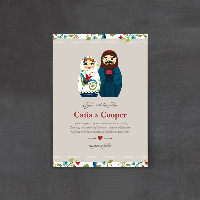
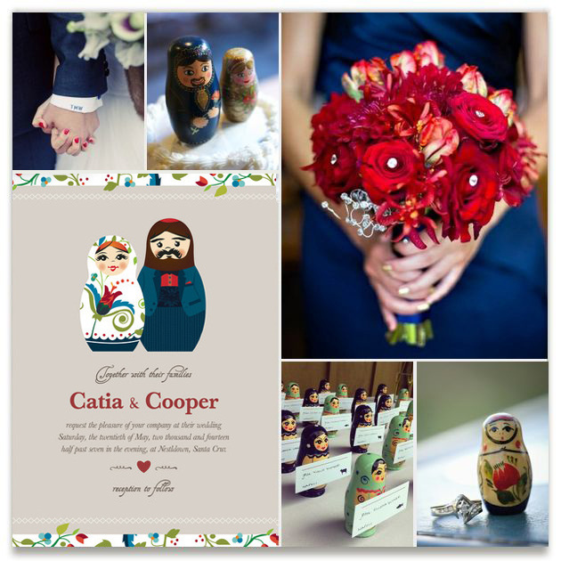
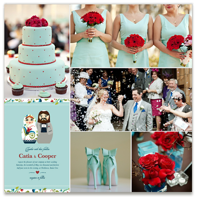
Matyroshka Wedding Invitation - Designed for minted.com customers, this whimsical, modern invitation features Russian nesting dolls, floral elements, bright bold reds and bold blues contrasting a soft grey hue.
Mood boards show couples how the Russian Nesting Dolls invitation can be integrated into their wedding. Selected color combinations, inspirational imagery and coordinated elements complement the invitation and bring the wedding to life. Editor's pick for cultural stationery.

Fish Upon a Star - Available on minted.com for parents to welcome their newborn babes, this art print features a little bear finding a comfy seat on the moon as he fishes for stars in the night sky.
The watercolor background add depth and texture, while the soft palette and simple shapes of the moon, star, and cloud complement the cute cuddly bear. The bear fishing for a star — customizable with the child's name and birth year — adds whimsy and charm that families can enjoy for years.
Company Timeline

100 Year Timeline - California Casualty, an auto and home insurance company tailored to those who serve our communities, celebrated a century of service in 2014. A 100 year timeline commemorates key events throughout the company’s history. The banner is displayed at all three California Casualty locations: Arizona, California, and Colorado, to remind and educate employees about the Insurance Company's rich history and growth. The timeline incorporates facts about the family-owned company, the inception of Group Associations, and Recognition Awards.
Identity
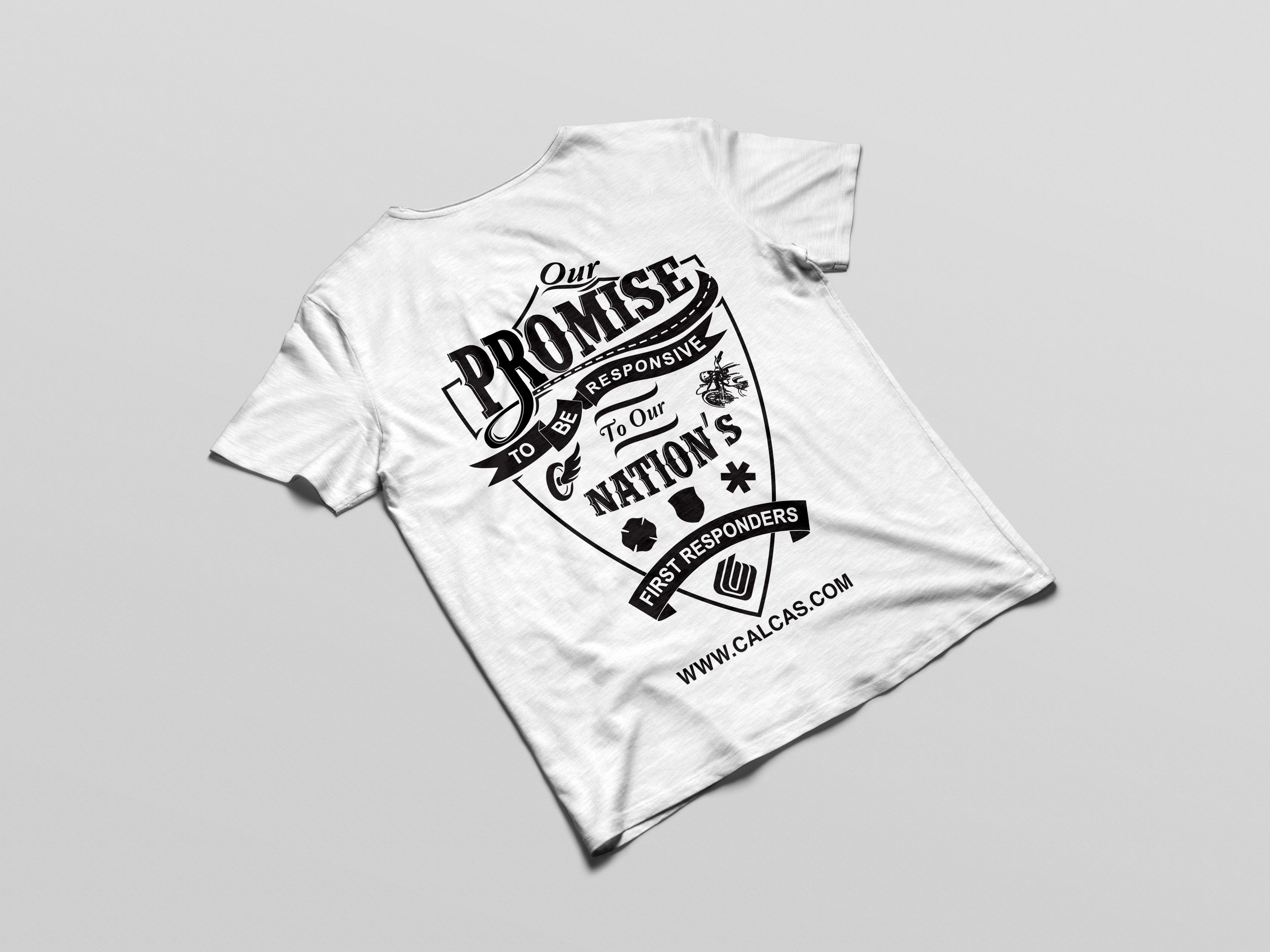
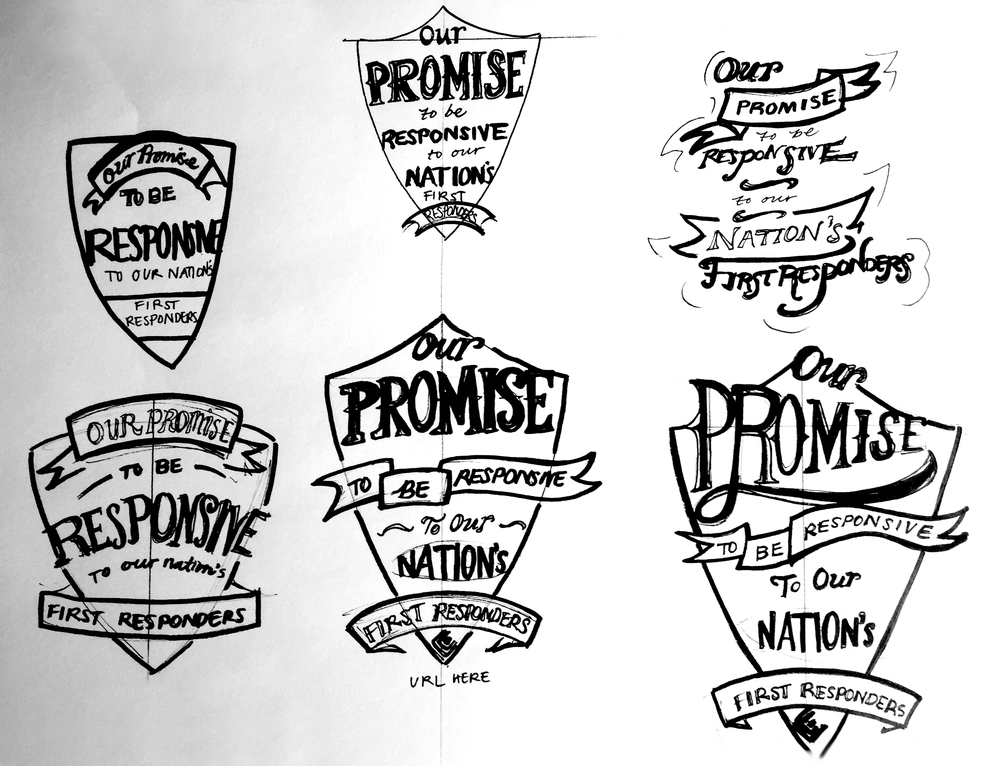
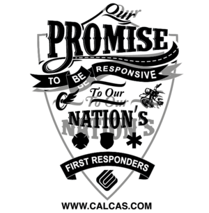
First Responder Shirt - This project's goal was to design a first responder brand energizer that incorporates company branding. The challenge was that the design needs to appeal to first responders and communicate the exclusive insurance California Casualty offers. The solution our team came up with is a t-shirt that incorporates California Casualty branding, promotes the company's Harley giveaway, and entices first responders to get an insurance quote.

Free Yourself Training is a fitness and training company based in Mountain View, CA. The challenge was to create a design that was strong, bold, and impactful, and incorporates the company name. The final design incorporates the "Free Yourself" company name illustrated in the form of a flying bird. The bird form is also symbolic of the feeling of flight at the end of a great workout.