

Visual Design exercise final product: first rebrand poster of the drought series.
project overview
Visual Design project divided into teams of brand story, text and content, typography, color and layout to rebrand the drought in California.
LENGTH TARGET TEAM
1 hour Consumers 50 UX Design Students
CHALLENGE
Rebrand the perception of the drought to communicate the importance of water conservation. Present typography and color palette that reflects a softer approach that establishes an emotional connection, as opposed to the alarming palette depicted today.
ROLE
Worked on the typography and color palette team consisting of 10 other UX Design Students. Worked agilely with other teams (brand story, content and layout) to present the first rebrand poster of the drought series.
TOOLS
The Whiteboard, Adobe Color CC, Adobe Illustrator
SOLUTION
Design a series of posters with a subtle alarming tone to educate, inform and encourage water conservation, and inspire consumers to act. The new approach achieves this by providing the following:
- An educational fact about water to give individuals perspective on their personal water footprint.
- Imagery and colors that complement the message and communicate the power of conservation.
- Relatable messaging that encourages individuals to conserve their personal water consumption.
— RESEARCH —
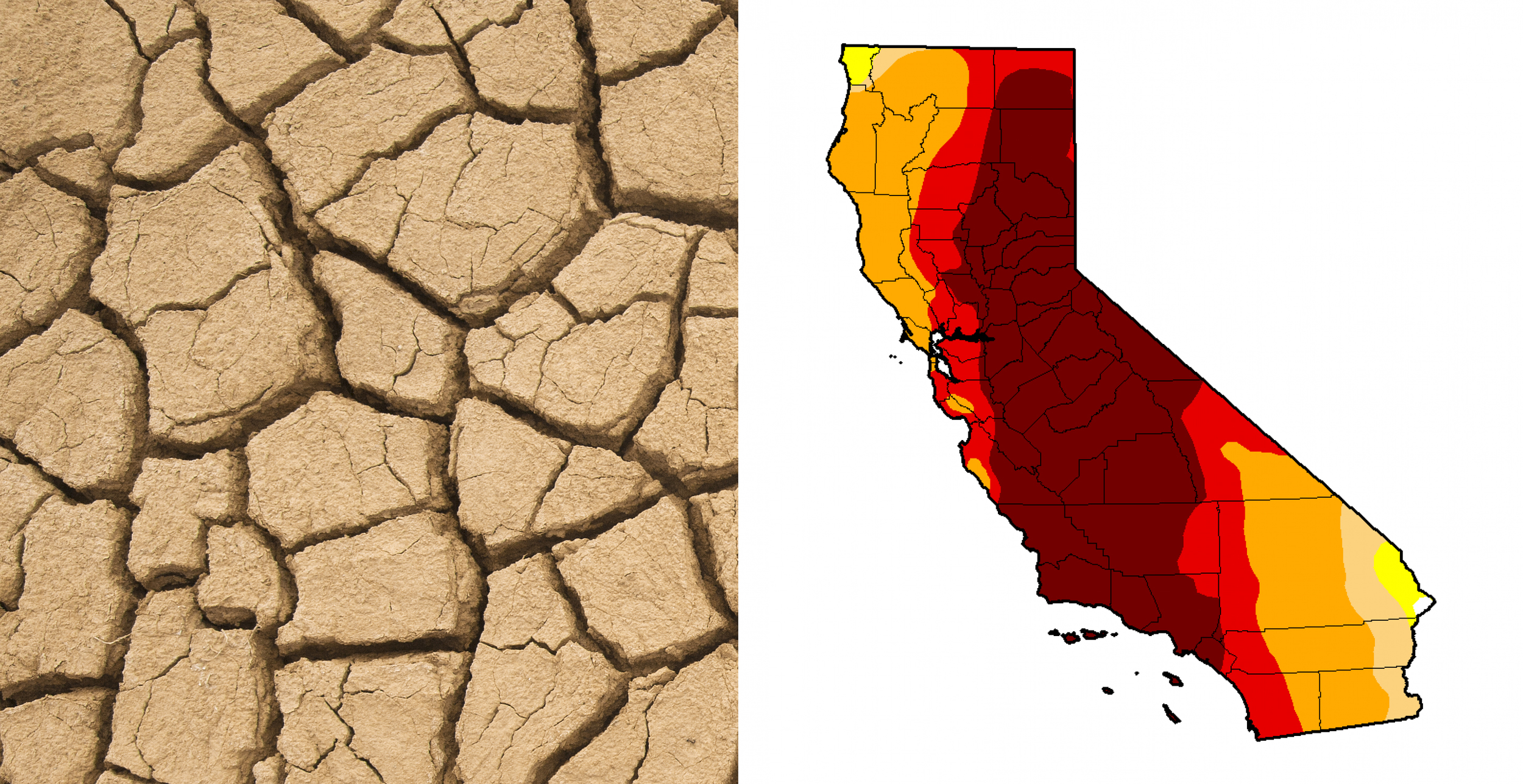
Existing imagery and palette uses an aggressive approach to convey the drought: wheat beige tones are used to alert the viewer while bright red hues prompt urgency. Credit for photos: Wordpress and Washington Post.

We selected a subtle gold accent color, #F2A800, from the existing California drought map, which was primarily filled with red hues. This warm gold swatch encourages consumers to take action.
THE REMAINING COLOR PALETTE

Our color palette team used Adobe Color to come up with complementary blue and brown tones.
Choosing a palette
Our team researched several existing palettes that included beige and wheat palettes and alarming red tones. Our team picked up on other underlying tones, and aligned on a more subtle palette of blue shades to mimic sky and water, and brown shades for consumers to associate with the earth, soil, and almonds.
typography

Selecting appropriate fonts
In our rebranding, our team modernized the drought by bringing in playful sans-serif fonts.
Facile Sans features thin strokes and rounded out corners that pull the viewer in and give the poster a welcoming, whimsical appearance. The alternating thin and thick strokes and stroke modulation makes the font more quirky (ie—the "S") and humanist in design.

Gotham served as the sub headline, conveying a subtle, modern and playful approach with its bold blocky letters. It's contrasting bold letters played as the perfect complement to the quirkiness of Facile Sans, giving an underlying serious tone to this playful and quirky poster.
— FURTHER STEPS —
Because the drought is an ongoing issue, this is the first in a series of informational posters empowering consumers to take action by reducing their water footprint. The series will continue to inform users on their impact of water consumption by providing new impactful facts, and using visual storytelling to communicate the significance of working together to solve this problem.