
Intrepid UX Design
ROLE
User Research, Comparative Analysis, Surveys, Contextual Interviews, Persona, Journey Map, Wireframe Sketches, User Flows, Usability Tests, Prototype, Further Steps
TOOLS
Illustrator, OmniGraffle, InVision
PROJECT DESCRIPTION
Full-scale product/service re-architecture for Intrepid, a tour-based travel agency.
LENGTH CLIENT TEAM
2 Weeks Intrepid Tatiana Golubeva
Shawn Wong
CHALLENGE
Business: Intrepid offers affordable tour-based travel services attracting travelers in their 20's. They would like to redesign their site to appeal to an "older demographic." The site will need to translate easily to a mobile platform.
Users: Travelers don't trust packaged tours as an affordable and authentic cultural experience.
SOLUTION
Redesign the existing website to effectively communicate the authentic experiences Intrepid offers. The new approach achieves this by providing the following:
- Authentic local reviews on desired destination
- Restructured navigation based on traveler priorities
- Built traveler trust by listing detailed package information
User Research
COMPARATIVE ANALYSIS
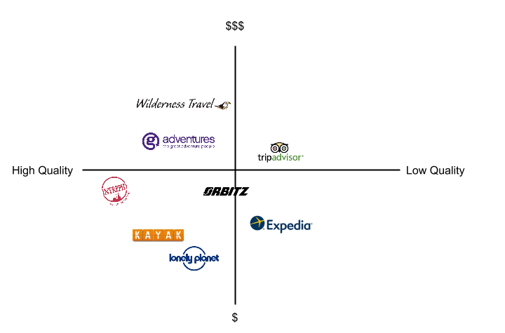
Intrepid's business model offers quality tour-based travel packages at an affordable price point.
EVALUATING THE COMPETITION
Comparative analysis helped me see where Intrepid is positioned on the comparative map.
BROADENING THE SCOPE
Our team was able to leverage more opportunities for possible solutions by researching all travel competitors as opposed to exclusively tour-based travel agencies.
WHO IS THE OLDER DEMOGRAPHIC?
We maintained Intrepid's existing business model of affordable tour-based travel services by making an incremental ascent to travelers in their 30's - 40's.
SURVEYS AND DATA

Survey results showing priorities ranked by importance. Based on a 1-10 rating scale, (1 being the lowest and 10 being the highest.)
SURVEY RESULTS
The results from a survey my team and I conducted and national travel metrics helped us find travelers most significant priorities.
THE NAVIGATION SEQUENCE
When sketching wireframes, each of us struggled in determining the appropriate navigation sequence. I referred back to the survey results to inform my design decisions.
WHAT DOES THE USER WANT?
We pursued the navigation I drafted because the concept was based on our research findings.
CONTEXTUAL INTERVIEWS
Comparative analysis, survey data and contextual interviews helped to formulate a persona. Our research helped us determine that females were the primary travel planners. My role was to interview participants as my team members recorded information. Of the eight travelers interviewed, all wanted an authentic experience and are not concerned with reading like-minded reviews. Local reviews directly from the source are preferred to achieve a real sense of culture. I was so inspired by the responses, I went home and conducted more interviews to bring my team a diverse range of responses.


“I really want an authentic experience. Touristy places are sort of like fake people. I don’t want the sanitized experience that people think I want to see. ”
“We decide what kind of experience we want. It’s usually somewhere warm near an ocean... the Carribean, Fiji, Jamaica... where the water is warm.”
“Interacting with locals and having street food experiences are my favorite things when I travel...it’s an awesome way for me to learn about new cultures. ”
The Primary Persona

PROFILE INFORMATION:
PROFILE INFORMATION:
AUDREY SMITH, SR. AUDITOR
AGE: 34, INCOME: $85,000
MOTIVATION: Escape from everyday work and relax with her partner.
PAIN POINT: Concerned about inauthentic tours with hidden fees or inaccurate ratings.
CONSTRAINTS: Work schedule, caregiver for her child and petsitter for her dog.
JOURNEY MAP KEY FINDINGS/PATTERNS:

My team thought it would be useful to formulate Audrey's problem by creating a journey map. I went home and sketched the persona to get in her mindset.
I imagined what would motivate Audrey to visit Intrepid's site. I sketched her and her friend Lisa in a coffee shop. As they sip their coconut frappucinos, Lisa recalls her recent experience at Jellyfish Lake in Palau. She shares her experience with Audrey and recommends Intrepid.
This sketch helped my team develop empathy and make a human, emotional connection to the product.
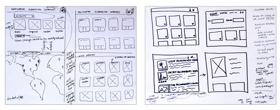
Wireframe Sketches
During the sketching phase, we each had different ideas on how to approach Audrey's challenges. The commonalities and patterns revealed during a converge/diverge exercise helped us make informed design decisions. We found the navigation was dictated by the travelers' top priorities: destination, scheduling, and activities. The common theme running through each of our designs was remarkably clear: all our concepts were based on the traveler's top priority of destination.
Informed Iterations
In order to prioritize and resolve Audrey's challenges, my team and I performed usability tests. We found travelers felt at ease when they were able to search for their desired destination quickly, have the ability to explore, and view an in-depth description with tabbed itinerary on the Activities page.

REVISED HOMEPAGE WIREFRAME
Usability testing informed us that the destination needed to be pronounced, and travelers wanted to be able to search other locations if they didn't have a pre-determined destination. As a result, the below changes were made:
- Secondary priorities moved to a sub-navigation.
- Shortcuts added to top of global navigation.
- About and Deals sections added to give clarity and show transparency in travel fees.
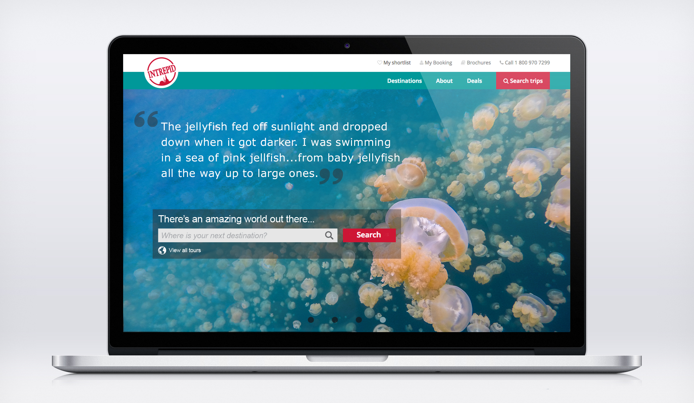
ORIGINAL HOMEPAGE WIREFRAME
The original wireframe was simplistic and low-fidelity because the goal was to test the basic site functionalities. Patterns revealed during usability testing helped us determine changes that would improve the user experience. The following designs were maintained:
- Large destination search bar.
- Quote from local for authentic account of region.
- A carousel of exploratory hero images.

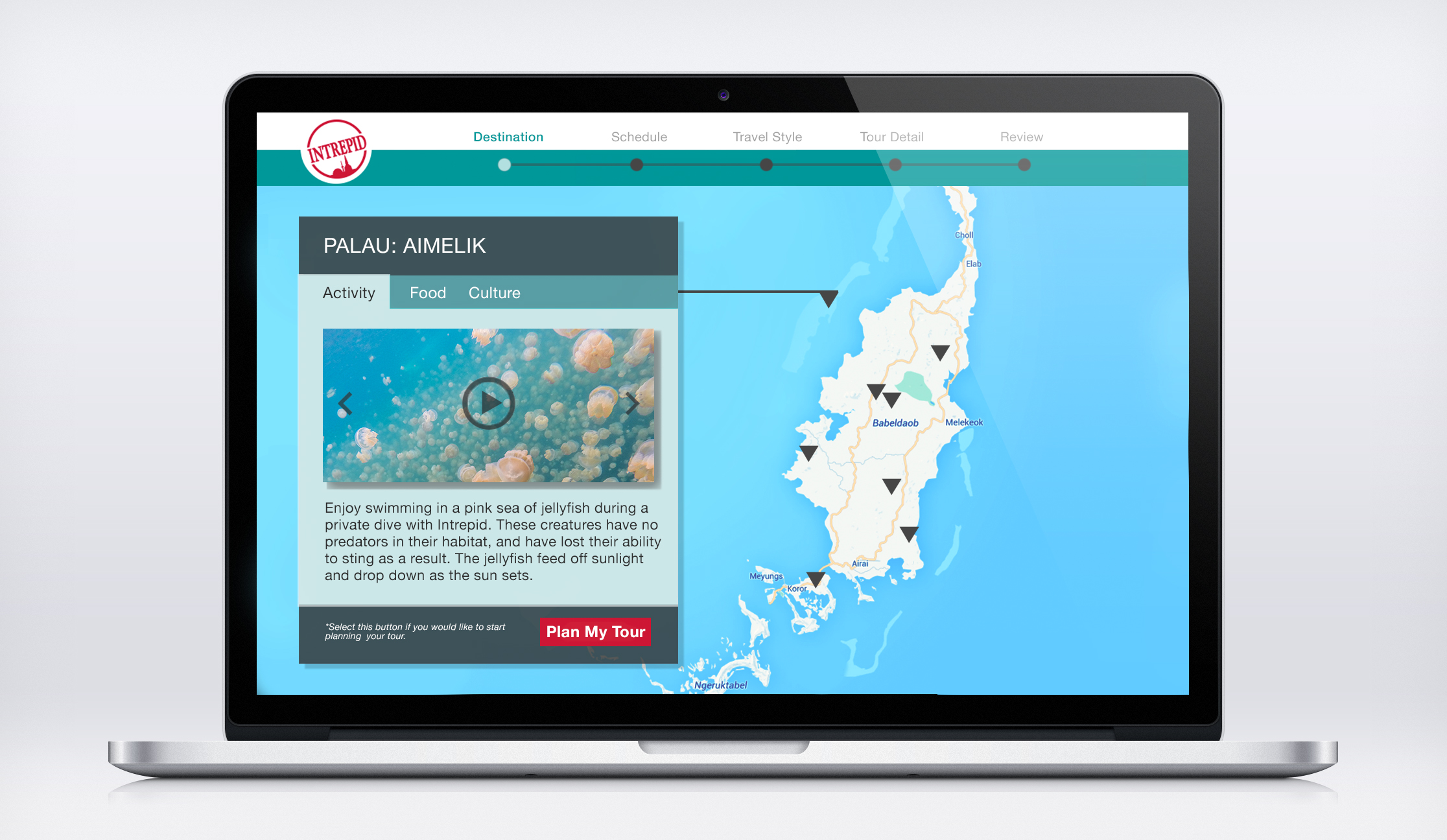
REVISED ITINERARY WIREFRAME
The following edits were made:
- Sub-navigation: guided user through travel process.
- Map: detailed map and created guideline of trip.
- Itinerary information: created detailed tabs.
ORIGINAL ITINERARY WIREFRAME
The following edits were identified:
- Sub-navigation: make a guided process.
- Map: need more details and guideline of trip.
- Itinerary information: needs to be more detailed.
After separating "Package Styles" and "Activities" into two distinguishable steps, users were able to find the information they needed to continue their planning process.
Further Steps


EXTENDING TO MOBILE
The business is interested in pursuing a solution that would translate easily to a mobile platform. On mobile devices, regions can be separated into buttons, with the ability to zoom in on the map feature once a destination is selected.
FAVORITE ACTIVITY BOARDS
Activities can either be selected in a checked list format, or displayed as thumbnails and saved to favorite boards for a later date. Newly added favorites are displayed when selected. Activities would be rated by other travelers.